Are you an email marketer looking for ways to craft welcome emails that help you establish a strong connection with your new subscribers?
If this is you, you’ve come to the right place!
In this post, we’ll discuss everything you need to know about welcome emails and why they’re a must-have for every email marketer. We’ll also show you 17 inspiring welcome email examples that can teach you a thing or two about sending welcome emails the right way.
First, though, we want to make it clear why you should be sending welcome emails and how they can specifically contribute to better conversion rates. The more you engage with your audience, the better, but welcome messages are particularly beneficial.
What is a Welcome Email?
A welcome email is the first email you send to your new email subscribers after they sign up for your mailing list. They say first impressions matter. Welcome emails are a great way to make a good first impression on your audience by connecting with them. You can also use a welcome email series to introduce your brand to your audience in a specific and personal message.
We’ll discuss some of the most popular types of welcome email examples below, but in most cases, you want to let your new customers know that you’re going to provide value.
Some marketers squander the welcome email. They simply write a welcome email to introduce themselves and thank the audience. That’s fine, but you can do much better.
Maybe you could share a fascinating insider tip, for instance, or an introductory coupon code that’s valid for only a limited time.
Whatever the case, show your audience they haven’t made a mistake by signing up for your email list.
Welcome Email Statistics
Research by GetResponse shows that welcome emails have an impressive average open rate of 63.91% and a click-through rate of 14.34%, which is 3 times more than that of regular newsletters. Pretty impressive isn’t it?
Those are amazing numbers, but I think you can improve upon them. By targeting the right consumer at the right time, you can boost open and click-through rates.
Related Reading:
Why Should You Send Welcome Email to New Subscribers?
Welcome emails are like a virtual handshake, greeting new subscribers and thanking them for connecting with your brand.
Most new subscribers will be looking out for an email immediately after subscribing that verifies that they are now part of your mailing list. Therefore, it is crucial for you to send a welcome email as it also sets the stage for future communication.
Here are some core benefits of sending a welcome email:
- Confirms Subscription: A user could subscribe to your newsletter via website popup, social media, SMS, or any other means. A welcome email will not only greet the person but also confirm their subscription.
- Establishes a Connection: Furthermore, welcome emails build rapport. They show you respect your audience and that you’re grateful to them for subscribing.
- Sets Expectations: It’s also a way to set expectations from the very beginning. What should your audience expect to receive from you? What value do you bring to the table? And why should they continue to open and engage with your emails?
What is the Main Purpose of Sending a Welcome Message?
Apart from being a welcoming gesture from the brand, a welcome email serves some core purposes.
Let’s discuss them below.
- Email Verification: Sending a welcome email helps you verify the subscriber’s email address. This helps you keep a clean email list because invalid email addresses will affect your bounce rate negatively.
- Brand Introduction: You can use a welcome email to officially introduce your brand to your potential customers. It’s a great way to give your potential customers some insights into your brand vision and goals.
While all the information about your brand and products can be shared in the email copy, you can add links to specific landing pages and social media channels to get the subscribers acquainted with your brand.
- Brand Loyalty: When you take the time out to send personalized welcome emails, it tells your new subscribers that you’re not only grateful for the sign-up, but you’re also looking forward to building a long-term relationship and customer loyalty.
Components of Welcome Email
A welcome email comprises of several key components designed to make the subscriber feel appreciated and valued. But make your welcome note stand out and make a good impression, you need to learn the art of writing these emails.
Here’s a list of importnat elements of a good welcome email:
- An introductory note to welcome and greet the subscriber. A touch of personalization here would be effective.
- A link to confirm the subscription should always be added to this email for double confirmation.
- The welcome email subject line should always be inviting and have a personal touch.
- The body of a welcome email should provide a list of benefits the subscriber will derive from connecting with your brand.
- A section of the email should be dedicated to the Introduction to the brand.
- Link to your privacy policy to reassure your new subscribers that you won’t abuse their contact information.
- A soft introduction of your primary product or service. (Don’t go for the hard sale. Just let subscribers know what you sell and why it’s beneficial).
What Is the Best Way to Get Email List Subscribers?
Collecting email list subscribers is the first step to an awesome email marketing campaign. You can’t send welcome emails if nobody subscribes to your list.
Hello Bar allows you to collect email list subscribers quickly and easily from any page on your site. Install a top bar, for instance, that demonstrates your offer and invites subscriptions.
Top bars aren’t the only option. Sliders can also work well, especially when they’re put on a delay so they don’t show up the second a visitor arrives on your page.
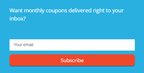
Exit popups are your last-ditch effort to wrangle a subscription. When a visitor’s mouse drifts toward the button to close the browser, he or she will see the exit popup.
Use bars in different styles to convince people to sign up. Make sure you have a warm welcome email in the wings so you can greet those subscribers right away.
Welcome Email Best Practices
A well-crafted welcome email can deliver great ROI. We’ve listed down some of the best practices you should focus on while creating and managing your welcome email series.
- Use Double Opt-in: A good way to ensure high deliverability rates is by using a double opt-in process. You can implement double opt-in by asking users to confirm their subscription via a separate landing page or email before actually adding them to your mailing list.
- Get Your Timing Right: Your welcome email can easily get lost in a crowded inbox if you don’t strike while the iron is hot. Essentially, this means that you should send a welcome email at most within 24 hours from when you get a new subscriber as this is when they still have your brand at the top of their minds. Any later, and they may end up forgetting they even signed up in the first place.
- Provide Clear Next Steps: Your welcome email template should clearly tell your subscribers what you want them to do. Use clear, simple CTAs that are easy to understand. As you do this, try not to overwhelm subscribers with too much information as this can easily cause them to lose interest. Let the email body include only the need-to-knows and save the rest for later.
- Include Opt-Out Links: Subscribers have the right to opt-out of your email list whenever they like, even if it’s right after they’ve subscribed. Make it easy to unsubscribe by putting visible unsubscribe links. This will help you easily remove bad leads from the get-go.
Common Types of Welcome Emails to Include in Your Email Marketing Strategy
Let’s get into some of the specific types of welcome emails you might want to send your audience. Each is tailored to a different goal, and you might want to A/B test different options to see which perform best among your subscribers.
Self Introduction Welcome Email
Use this welcome email to introduce yourself and your brand to email subscribers. Explain why your company exists, what you sell, and how you bring value to the table.
In many cases, welcome email examples often include the welcome gift you advertised in your opt-in form. Perhaps you advertised a free checklist or cheat sheet in exchange for subscribing.
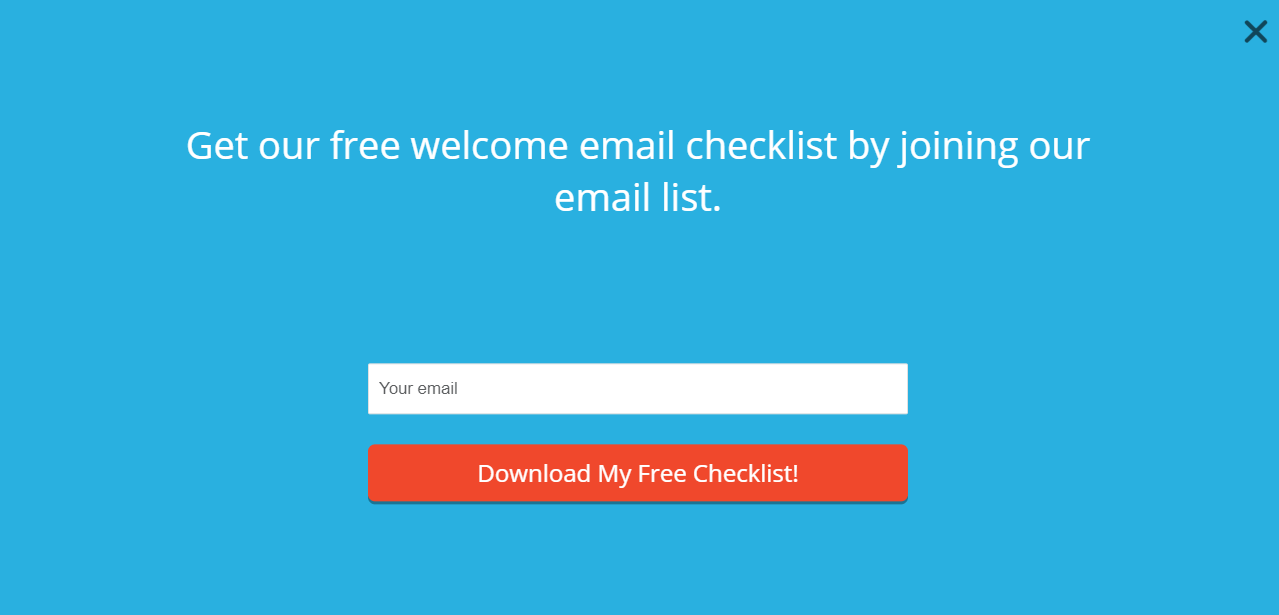
In this case, make sure the free download is attached to the welcome email.
The Special Offer/Discount Welcome Email
These types of welcome email examples are common among ecommerce businesses. You offer a special discount or other type of savings right off the bat.
For instance, in the welcome email example below, the cocktail brand Three Spirit starts by offering an attractive discount of 10% off the new subscriber’s first order. This will immediately grab the recipient’s attention and encourage them to make their first purchase.

Image via ReallyGoodEmails
Consider the type of product you offer and its price point. If you sell something that costs $20, you can speed up the conversion funnel and make a sale much quicker. In that case, a discount welcome email makes sense.
However, if your product or service costs thousands of dollars, you can’t go right for the sale. Consider other welcome email examples instead.
Instructions on How to Get Started Welcome Email
Let’s say someone has just bought from you and has agreed to be added to your email list. Sending a welcome email with instructions on how to get started can prove highly beneficial.
First, it will incentivize your audience to interact with whatever you’re selling right away. Second, it clears up any confusion about how your product or service works.
Be very clear and simple in your instructions. Write in the active voice and start every sentence with a verb. We also recommend adding photographs or illustrations to help further explain the instructions. Some people learn best visually.
At the end, include a link to your help center or FAQ page if available. That way, your subscribers can get further assistance without having to contact you directly.
The welcome email example below explains how the user can get started with the Citizen app. It breaks down the information into four short sections which make it easier for the user to quickly read through.

Image via ReallyGoodEmails
Lead Magnet/Content Upgrade/Free Trial Download Instructions Welcome Email
We’ve grouped these together because they all fall under the same category. You’re offering some kind of download, so you’ll need to introduce that download and provide any relevant instructions.
For a lead magnet, the instructions might be pretty straight forward. You’ll attach your e-book, whitepaper, or other download to the email, or include a clickable URL.
The same goes for a content upgrade. Maybe you’ve offered an extended version of an article you’ve written for your blog post. Again, use a download or a URL to provide the content.
For SaaS businesses and other companies that offer free trials, you might need to provide more instructions. For instance, the user probably needs a login and password to access the free trial. Explain in your welcome email sequence how to get started and what to do if the user has problems.
Here’s an example of a welcome email from a fitness brand Spartan. It offers a free trial to get the target audience motivated to start using the fitness app.
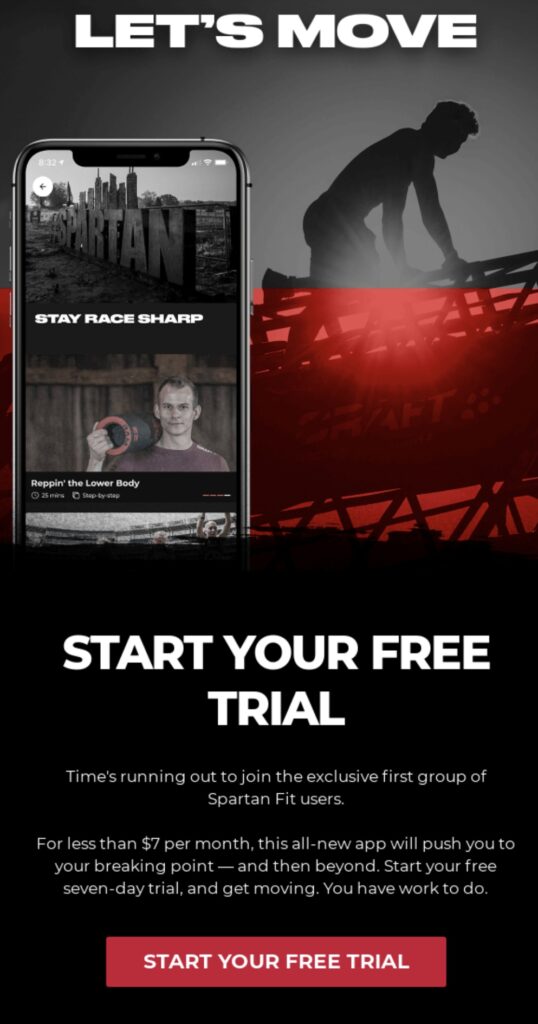
Image via ReallyGoodEmails
Product Catalog Welcome Email
This is another ecommerce store favorite. You can send a whole product catalog with your welcome email to direct prospects toward products you think they might like. For instance, you could segment your audience based on the product pages they visited, then reinforce their interest in those products with relevant content.
If you’re sending a product catalog welcome email, ensure you include high-quality images that are visually appealing. Include a clear call to action with a link to the catalog that makes it easy for interested subscribers to shop.
In the example below, Filson invites users to shop from its November catalog and showcases images of some of the products in the catalog. This invites the user to explore the catalog and browse for products they might like.

Image via ReallyGoodEmails
Social Proof Welcome Email
A social proof welcome email demonstrates your popularity in some way. It’s kind of like a beauty contest, but far less objectionable.
Testimonials from loyal customers can be powerfully persuasive, as can reviews from third-party websites. Show how popular you are with your existing customers.
To establish the credibility and popularity of your brand, you can try different tactics to include social proof in your email. You can find smart ways to include text messages, testimonial videos, ratings, and UGC in a welcome email to impress your prospective customers.
In the email below, the dental healthcare brand Bite, shows how to leverage the power of social proof to establish first impressions. This persuasive welcome email showcases recommendations from noted brands. A clear CTA button is also included to encourage users to check out more reviews from happy customers.
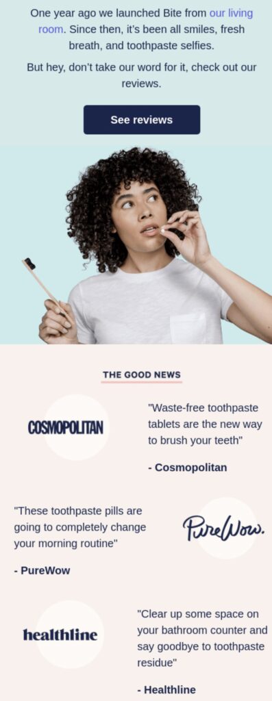
Image via ReallyGoodEmails
17 Welcome Email Examples to Inspire Your Next Email Campaign
Now that we’ve covered some of the types of welcome email examples you might emulate, we want to show you how they work in action. We’ve chosen some of the best welcome email examples We’ve ever seen so you can get inspired and create your own.
1. Amazon
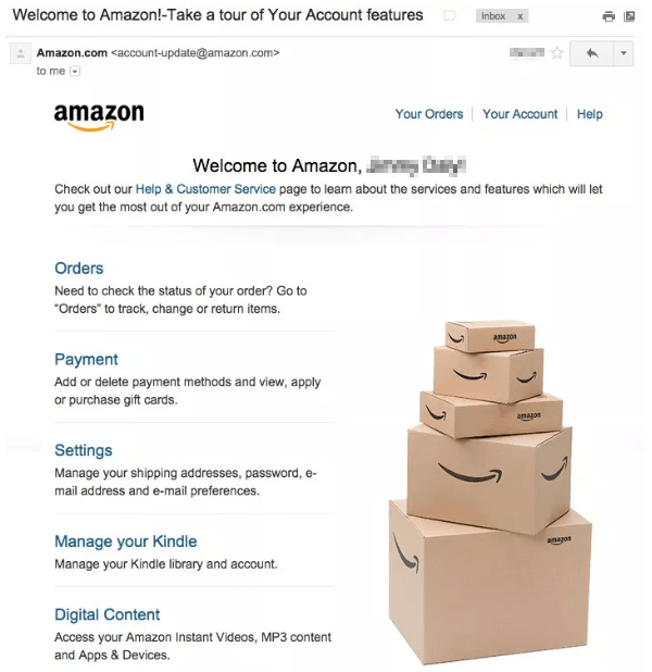
Amazon needs no introduction. It’s fantastic at all types of ecommerce marketing, from email to social. We’re particularly impressed with its welcome email, though.
This is just one of Amazon’s many impressive welcome email examples. It customizes its emails based on how you signed up for an account or for the company’s mailing list.
In this case, it reinforces the branding with that stack of boxes, each of which bears the Amazon logo. Then there are convenient hyperlinked subheadings naming all the major pages you might want to check out, plus a small bit of body copy underneath each to describe its benefits.
You might notice that it’s pretty simple. That’s okay, especially for a big brand.
2. Uber
Uber’s welcome email for customers (versus potential drivers) is a bit longer than Amazon’s. It includes several widely-spaced sections, which makes it easy on the eyes, and it incorporates the instructional aspect of welcome email examples very deftly.
Easy as 1, 2, 3, right? The instructions also incorporate benefits, such as ease of use. That’s a great way to set apart your brand.
Other parts of the email include contact details and a brief thank-you to the subscriber.
3. Ticketmaster
If you enjoy concerts and other events, you might be familiar with Ticketmaster. It’s one of the most popular places to buy and sell tickets.
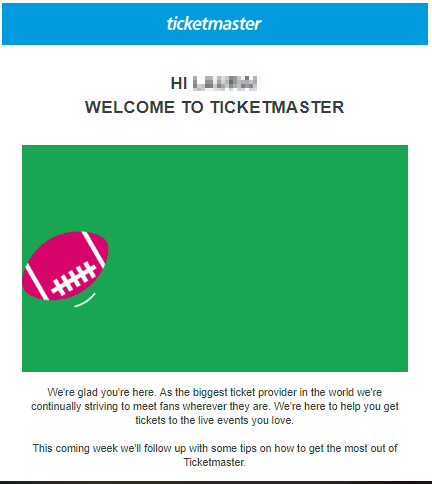
When you buy tickets through Ticketmaster, you get a fantastic welcome email. There’s an animated gif right underneath the company logo as well as a friendly greeting.
The favorite part of this welcome email example, though, is the very last sentence. After outlining the brand’s USP, the email says, “This coming week we’ll follow up with some tips on how to get the most out of Ticketmaster.”
That’s an elegant and effective way to set expectations. The subscriber knows exactly what he or she will get in the future emails.
4. Nike
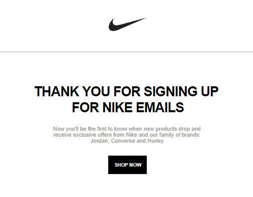
We like Nike’s welcome email because it’s short and sweet. First, you get a friendly introduction to the brand with the familiar Swoosh and a thank you. Then comes the value proposition, which tells you why you’ll thank yourself for signing up.
Then there’s a CTA to sign up for Nike+. It’s an elegant way to lure consumers further into the company’s umbrella and encourage them to engage more with the brand.
5. Todoist
If you’re not familiar with Todoist, it’s an app that allows you to create electronic to-do lists. When you sign up for an account, you receive a welcome email. The first part welcomes you to the Todoist family and shares the benefits of a membership.
Then you get handy buttons so you can download the Todoist app on your mobile device. This is smart on the company’s part because people need access to their to-do lists while on the go.
Couldn’t be easier, right? That’s the great thing about the best welcome email examples. They are ease of use, contain a perosnalized message and help the subscriber take action immediately.
6. Benny Lewis
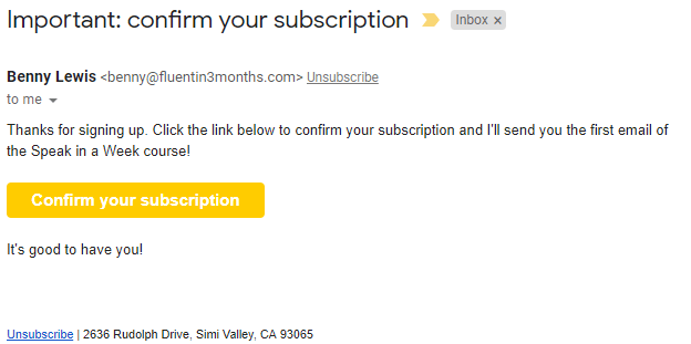
We wanted to include some brands in this list that people might not know about. Benny Lewis is an expert in teaching people how to learn new languages faster and easier by simply speaking the target language.
When you sign up for his emails, you get a short and sweet confirmation email that reinforces the value of his lead magnet.
Notice that the CTA button is highly visible on the page. Otherwise, this is a plain-text email that doesn’t waste the subscriber’s time.
7. Bicycling.com
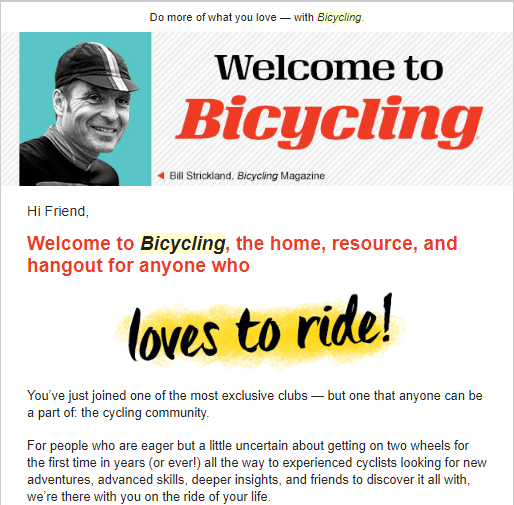
We love the welcome email from Bicycling.com. It’s colorful, positive, and conveys exclusivity. It’s also heavily focused on the magazine’s USP, and it makes beginners feel comfortable and welcome while still acknowledging that veteran cyclists can benefit from their subscriptions. Awesome.
8. Facebook
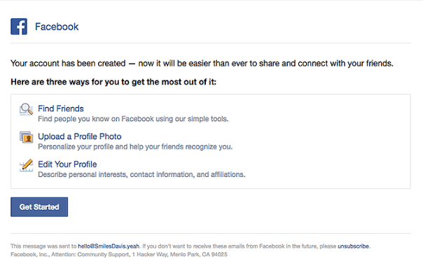
We might as well acknowledge Facebook here because the company has marketing down to an art and a science. Its welcome email is deceptively simple, but that’s because it wants users to do one thing: Engage with their followers on Facebook.
It tells you exactly how to do just that with links to find friends, upload a profile photo so you’re more visible, and edit your profile so it matches what you want to share.
Then there’s a Get Started CTA for good measure. Well done.
9. Nextdoor
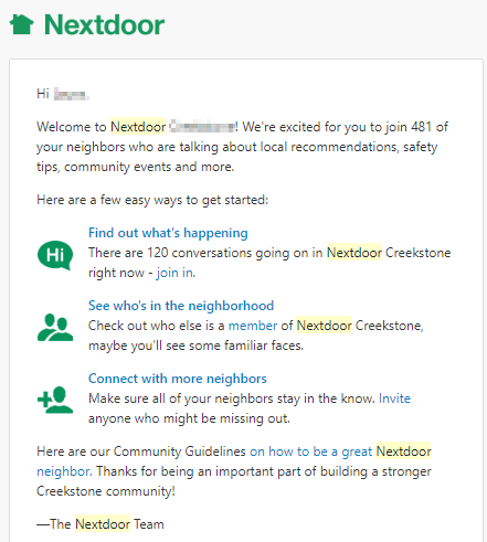
If you haven’t given Nextdoor a try, you might want to consider it. It’s a social networking site that unites people who live in the same neighborhood, community, or general geographic area. Its welcome email is simple but effective.
First, there’s social proof. It tells you how many of your neighbors have also signed up. Then there’s a list of benefits for members.
Then you have a list of CTAs so you can immediately interact with the site
10. Medium Partner Program
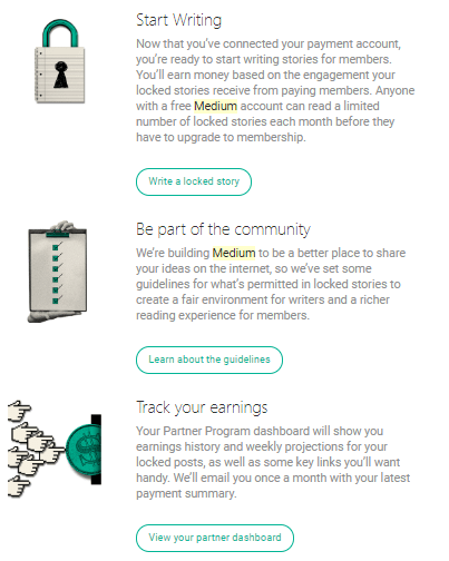
Medium.com has a Medium Partner Program, which allows writers and other content creators to get paid for the work they publish on the platform. When you sign up, you get a fantastic welcome email.
After a personalized welcome message, Medium tells you exactly how to get involved with the community, publish content, and keep track of your earnings.
11. ButcherBox
ButcherBox allows you to sign up for a subscription plan that delivers meat to your front door at regular intervals. If you sign up for the ButcherBox mailing list, you get a welcome email that invites you to get a subscription and enjoy free meat in the process.
Not only can you get filet mignon and bacon for free, but you also get $10 off your first box.
This is a great example of marketing in general. The company is tempting its subscribers with an excellent offer for people who value well-priced meat and the convenience of delivery.

12. Magnolia Market
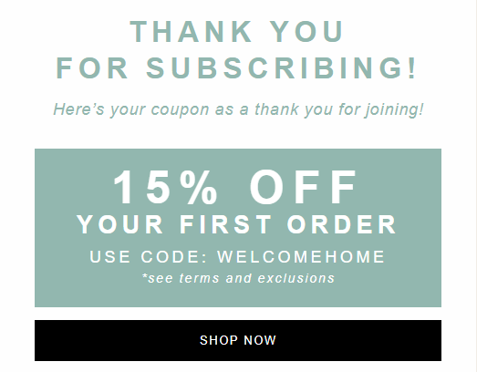
Even if you’re not an HGTV fan, you’ve probably heard about Chip and Joanna Gaines. They’re the stars behind “Fixer Uppers” and have become serial entrepreneurs. Their ecommerce store, Magnolia Market, has an awesome welcome email. First, you get a photograph of the proprietors.
Then there’s a big thank-you along with the lead magnet: a 15-percent-off coupon.
See the bold CTA? It’s bold and has lots of contrast, which means people are more likely to click it. Associating the discount with the SHOP NOW offer makes it more attractive. Yes, you’ll spend money, but you’ll get a discount in the process.

13. Miro
Miro is a digital whiteboard platform that makes it easy for teams to collaborate on tasks and communicate virtually. Its welcome email starts by cleverly using the phrase “Welcome on board…”, which is a clever play on the type of platform it is.
Miro’s welcome email design simulates the feeling of being on a whiteboard, which creates a memorable and immersive experience for new subscribers. It also uses a simple, clear CTA that directs users to start using the platform.
This welcome email emphasizes ease of use by telling users how quickly they can create a new project– less than a minute. This is good way of inviting users to try out the platform because of how quickly they can use it to achieve something.
Another standout feature in this email is that it doesn’t just invite users to try out the platform, it also shows them how to do so in three easy steps. This is a great way of onboarding new users and making it easier for them to navigate the new platform.

Image via ReallyGoodEmails
14. Godfrey Pontoon Boats
In the next welcome email example, a pontoon manufacturing company Godfrey Pontoon Boats, showcases a heartwarming image of its product in use. This aims to welcome new subscribers and immediately establish a connection with them.
Godfrey Pontoon Boats has been in business for over 60 years and it clearly highlights this in the body of the email. Doing this serves as a way of using the brand’s expertise as social proof that will encourage new subscribers to do business with them.
This welcome email keeps it simple and uses a clear CTA to invite users to try its lineup of products. By separating the image and the email copy, it keeps attention on the text and doesn’t distract readers from the aim of the message.
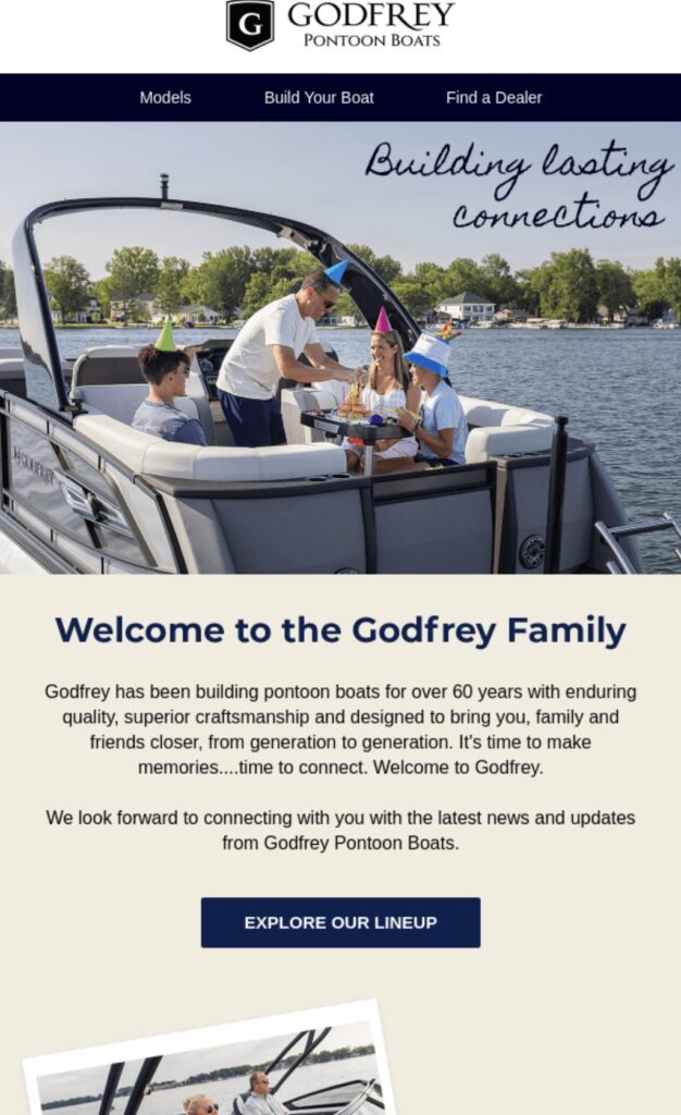
Image via ReallyGoodEmails
15. Metallica
The next welcome email example in this list is from Metallica, a famous heavy metal band. Metallica addresses the recipient using their first name as a way of establishing a personal connection with them.
Note that Metallica is a band made up of four members. However, the email refers to the user as the fifth member of their band and family. This makes new subscribers feel welcome and valued.
In Metallica’s welcome email, the most prominent features are the CTAs. Designed in a bright color that contrasts against the black backdrop of the email, the three CTAs all direct the user’s attention to different courses of action. This way, users can easily get presale tickets, join forums, or get access to more exclusive content.
This email goes one step further in trying to establish a connection with new subscribers. It displays Metallica’s social media icons and encourages users to connect with them on social media and join a community of people who are interested in Metallica’s music as well.
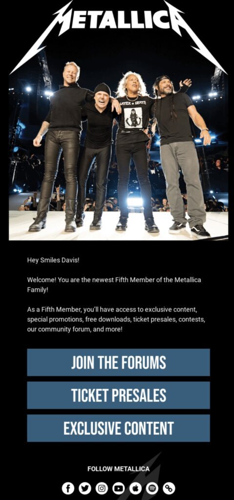
Image via ReallyGoodEmails
16. Glossier
Glossier is an online beauty brand that offers a range of fragrances, skincare, makeup, and other body care products. This welcome email features a bright picture collage that instantly catches the eye and commands attention.
Glossier’s welcome email begins by introducing the brand’s story and giving a warm description of the inspiration behind Glossier’s products. Unlike other welcome emails, Glossier’s email goes for the hard sell and boldly invites new subscribers to try their products.
However, the email doesn’t just invite readers to shop, it also offers free returns and exchanges. This is a brilliant way of nudging new subscribers into becoming paying customers because they have nothing to lose if they just give the products a try.
The CTAs in this welcome email are creatively designed in bright blue. This makes them stand out against the stark white background of the email, making it easier for readers to take action.
Finally, Glossier’s welcome email invites readers to further connect with the brand’s team for more information. This way, if new subscribers need help with the order process or product recommendations, they can easily have all the support they need.
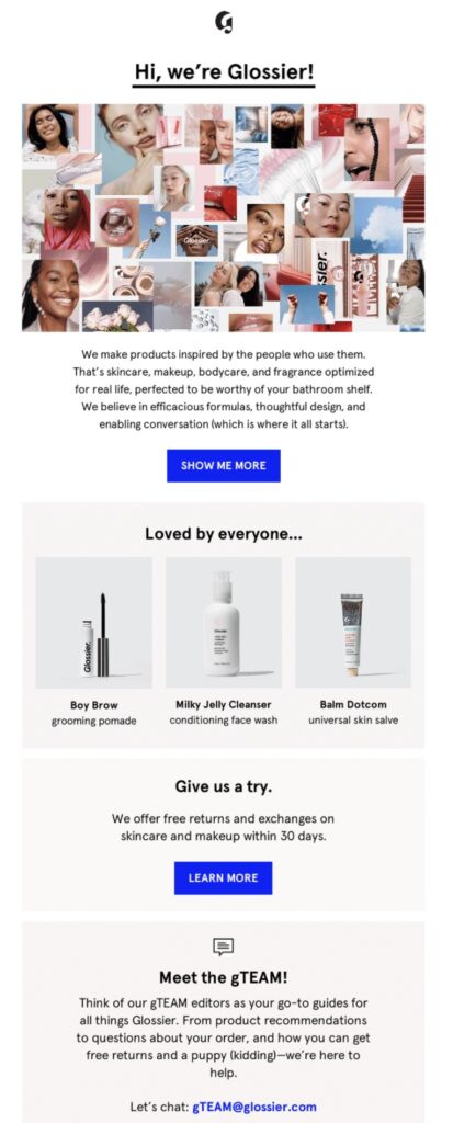
Image via ReallyGoodEmails
17. MailerLite
Here’s another welcome email example worth mentioning. This is from MailerLite, a popular email marketing platform. The email starts off in a friendly, welcoming way. It expresses gratitude to the reader for signing up for MailerLite’s newsletter.
MailerLite’s welcome email features a simple but functional design. Although it has much text, it remains readable and easily scannable. Opting the background plain is a good way to keep the reader’s attention on the email copy.
Besides welcoming the subscriber, this email highlights the helpful resources MailerLite’s weekly newsletters will include. It offers expert email marketing guides and tips that will provide value to new subscribers and make sign-up worth the effort.
This welcome email also allows new subscribers to choose what they would like to learn from MailerLite’s newsletters. This is a great approach that helps MailerLite tailor the content it provides to each subscriber’s needs.
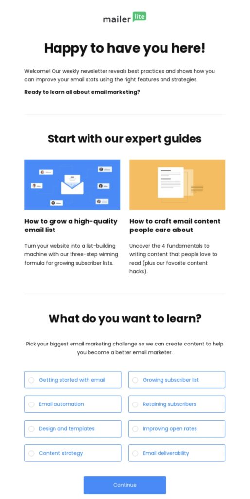
Image via ReallyGoodEmails
Engaging Welcome Email Subject Lines
As the subject line is the initial communication from your brand, it could determine if your welcome email will be read or not. Ensure you use catchy lines that do not sound spammy but instead, entice the reader to open and read your email.
Here are some examples of engaging welcome email subject lines you can take a cue from.
- You Have a Welcome Offer! Open to Take a Peek 👀
- Welcome! Thank You for Signing Up
- You’re Here! Let’s Get Started
- Hi [Name] We’re So Glad You’re Here 😊
- 20% Off Your First Order With Us 🎁
- Thank You for Joining Us! Let’s Get You Started
- Welcome! Are You Ready to Begin?
- It All Started 60 Years Ago…
- Unlock Your Free Gift 🎁 With This Coupon Code 🎟️
- Welcome to [Brand Name] 💞 You Have Great Taste
- We’re Glad You Signed Up! Start Your Free Trial Now
- Hello [Name], Are You Ready For an Adventure?
- You’re In! Here’s How Our Brand Story Begins…
- You’re Now in The Inner Circle ⭕ Let’s Begin
- Welcome 🤝 Let’s Get To Know Eachother
Is It Important to Personalize Your Welcome Emails?
Some marketers swear by personalization, while others insist it isn’t necessary — or even that it’s detrimental. If you ask me, the only way to know is to test.
Send half of your subscribers personalized opt-in welcome emails and send the other half emails without personalization. How do the open and click-through rates compare?
A personalized opt-in welcome email typically includes the subscriber’s name and other details specific to him or her. Keep in mind, though, that you might not always have the subscriber’s name.
In ecommerce email marketing, for instance, shorter signup forms work best. If you just ask for the subscriber’s email address in the opt-in form, you’ll get better results.
Use Hello Bar to Get a Lot More New Subscribers To Your Email List
You’re fully versed in welcome emails by now, so how do you put them in action? You start collecting email addresses.
Hello Bar allows you to introduce a lead magnet, display your GDPR compliance, and collect email addresses without any friction. And that’s important.
These days, people are inundated with emails. They aren’t going to want them from you unless you give them a darned good reason.
Supercharge your email collection process by using a top bar, slider, modal, exit popup, or other bar to let people know what they can get for signing up. Use a strong call-to-action phrase that makes visitors want to click.
Practice writing headlines, too. The stronger your headline, the more people will pay attention.
Conclusion
You didn’t think your welcome email was important, did you? Now you know different.
If you’re able to engage your subscribers from the moment they provide you with their email addresses, you’ll hit the ground running — and set yourself up to generate more revenue.
We also urge you to review the 17 welcome email examples we showed you. Figure out what you like about each and what you don’t.
As you craft your welcome emails, remember to make your subject lines as engaging as possible and avoid spammy words.
The more you experiment, the stronger your emails will become. A/B test them over and over again to find that sweet spot.
What’s the best welcome email you ever received? Comment below and let me know!