Lead capture is one of the most important ways to market your business, but to do it effectively, you need a slam-dunk lead capture form. A lead capture form allows your prospects to provide you with their contact details and other information.
There’s a lot of misinformation floating around the Internet about lead capture forms, so we’re going to set the record straight and provide you with 19 lead capture form best practices so you can boost your conversions by two times or more.
When you’re successful at capturing leads, you can nurture them through the sales funnel and build long-term relationships with them. The more you interact, the more brand loyalty you inspire.
It all starts with that simple form, though, and it’s easy to screw up. Let’s make sure you’re getting it right from the beginning.
Lead Capture Form Statistics
According to the Spring 2024 CMO survey, lead generation is one of the most important goals for 70.8% of marketers. A separate report by CMI (Content Marketing Institute) states that 89% of marketers generate leads using content marketing.
Furthermore, it may interest you to learn that Facebook (43%) and LinkedIn (42%) are the top two social media channels marketers use for lead generation.

Image via Social Media Examiner
Lead generation clearly is an important aspect of marketing. However, 15% of marketers still struggle to generate leads because they don’t know where to start. If you’re not sure how to begin using a lead capture form for generating leads, you’re definitely not alone.
What Is a Lead Capture Form?
Lead generation is the process of attracting and converting prospects into leads. A prospect becomes a lead when he or she provides you with some form of contact information, whether that’s on a lead capture form or during a sale.
A lead capture form allows you to collect contact information from prospects. In most cases, all you need is an email address. You can then switch your focus from lead generation to email marketing.
This doesn’t mean that you ever stop capturing leads. You don’t. But you can reach prospects, leads, and customers at different points in the conversion funnel as they become more brand aware and more qualified.
What Is a Lead Capture Form?
A lead capture form is a web form that invites your prospects to provide their information in exchange for something of value. This could be as simple as tips in an email newsletter, but including a compelling lead magnet can significantly boost your conversion rates.
To maximize the effectiveness of your lead capture efforts, consider using a tool like Hello Bar. With Hello Bar, you can easily design a top bar that presents your offer to every visitor, no matter which page they land on.

This approach is a great way to collect email addresses, whether you’re conducting a B2B email marketing campaign or marketing to consumers. As you learn how to build an email list and market to your leads, you’ll land more qualified leads and generate more sales.
Why Is It Important to Get Leads for Your Business?
Without leads, your business can’t grow.
In a Demand Gen Report study, nearly half (47%) of B2B buyers consume between 3 and 5 content pieces before they even engage with a salesperson when they’re making a purchase decision. People are spending more time comparing products and services, which means they’re not going to buy from you when they first encounter your brand.
That’s tough to hear, but it’s a reality every business owner must face.
If you’re not collecting leads with a lead capture form or other method, you’ll lose customers to the competition. Here’s why implementing lead generation strategies is a necessity for growing your business.
- Lead generation allows you to nurture consumers through the buyer’s journey and helps you build a long-term relationship with them.
- It makes more people aware of your business, thereby increasing your brand visibility and authority.
- The end goal of generating leads is sales conversion. Therefore, it helps to boost your revenue and grow your customer base.
- Lead generation gives you valuable insights into your potential customers. This enables you to refine your marketing strategies for more positive results.
Is It Hard to Create a Lead Capture Form?
It’s never been easier to create a lead capture form for your website. All you need is a Hello Bar account.
When you sign into your account, you’ll see a list of possible goals for your Hello Bar. Choose the one for growing your email list.

You’ll then see a simple form that you can fill out for your Hello Bar. Create your headline and call-to-action phrase, then click “Continue.”
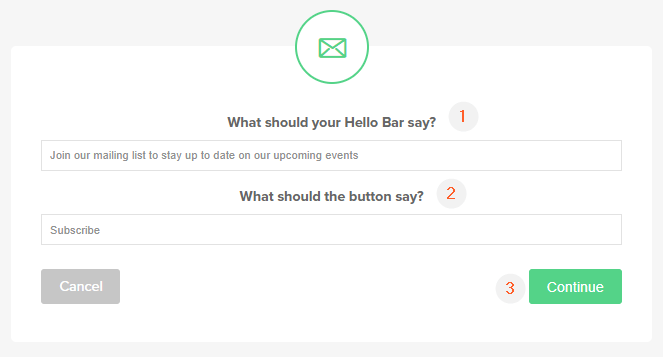
The menu that follows will show your website and your Hello Bar on the right and a list of menu options to the left. The menu options allow you to customize your Hello Bar however you like.
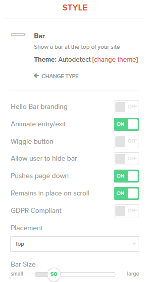
Click the “Next” button at the bottom to go through all of the customization options. When you’re done, you can publish your Hello Bar on your site.

In just four steps, you’ve created your very own lead capture form.
19 Lead Capture Form Best Practices to Grow Your Email List
If you’ve never created a lead capture form before — or if your current lead capture form isn’t working — We have some tips to help boost your lead generation efforts. They’ll help you get your website visitors’ attention and convince them they want to provide their contact information.
1. Define Your Goals and Keep Track of Your Results
Data is important no matter what stage of marketing you’re working on. If you don’t know what you want to achieve and what your progress looks like, how do you know if you’re succeeding?
Let’s say you’re starting from scratch. You don’t have a single entry in your email list. You might decide you want to collect 50 email addresses in the next 30 days. That’s reasonable.
Start tracking the number of emails you’re collecting. Your database will show you exactly how far you’ve come and how many more addresses you need to collect to reach your goal.
The great thing about collecting data from the start is that it can inform future goals. Maybe you collect 100 emails in that first 30 days instead of just 50. You know you need a more ambitious goal for the next month.
2. Create an Amazing Lead Magnet to Offer to Your Leads
Think of your lead capture form as a transaction on its own. You’re not asking your prospect to give you money, but you want something of value: his or her email address.
To balance out the scales, you need to offer something of value in return. A lead magnet incentivizes your organic traffic to convert.

See the words we boxed in orange? That’s the incentive. People who sign up for your email list get a free downloadable checklist.
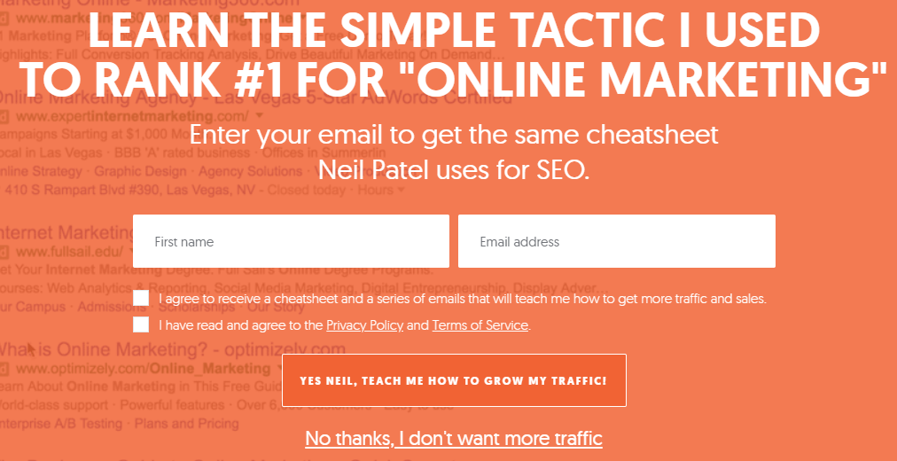
You can create any lead magnet you want, whether it’s an e-book, video, audio file, toolkit, or something else entirely. My business partner, Neil Patel, offers a free cheatsheet as a lead magnet on his personal site.
Do you see those two checkboxes underneath the fields for first name and email address? They’re there to ensure GDPR compliance.
By displaying a privacy policy and terms of service, this lead magnet aims to gain the trust of potential customers. It demonstrates that you will not infringe on the data they share with you or their privacy.
If you’re not familiar with GDPR, check out this video in which Neil explains it a little bit further.
The most prominent element in this lead capture form is the incentive, which appears in large fonts and contrasting colors at the top of the form. This strategic placement ensures it is the first thing a sales prospect sees when the form pops up.
The CTA in this lead capture form is direct and specific. Rather than use generic CTA’s like “continue” or “register”, the form uses a CTA that states exactly what the sales prospect stands to gain by signing up.
3. Define the Required Lead Capture Form Fields
A lead capture form consists of one or more form fields as well as any tick boxes or other elements. If you only have one form field, you don’t need to let your visitors know that it’s required. Otherwise, make sure you let visitors know which fields they have to fill out in the lead forms.
You can put “required field” underneath each field or you can use an asterisk and define it like what you see in the screenshot below.
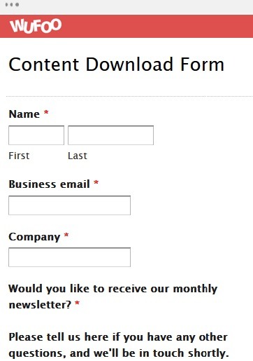
Image via Wufoo
4. Put in Effort to Craft the Perfect Headline for Your Lead Magnet Offer
We can’t emphasize enough the importance of the perfect headline for your lead capture form. If you’re offering a lead magnet, you need to make it as appealing as possible.
Let’s look at a couple of examples.
Here’s one headline:

And here’s another:

Which one are you most likely to find intriguing? This is a pretty extreme example, but you get the point.
If you’re not specific and enticing, your website visitors won’t convert on your offer. The first headline doesn’t tell the reader what the checklist is about or whether it’s free. Instant fail.
5. Add Testimonials from Past Customers Below Your Lead Capture Form
Top bars aren’t the only type of lead capture form you can create. If you use a larger format, such as a modal or slider, you can add more information to entice the reader.
For instance, you might add one or two testimonials from people who have already joined your list. It could look something like this:
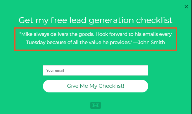
This is a modal Hello Bar, and the testimonial is the only added element. It generates interest, though, because it suggests value even beyond the lead magnet and delivers another reason for the visitor to sign up.
You can add more than one testimonial if you wish. Just make sure you include first and last names to give your testimonials more weight.
6. Use Social Share Icons and Social Proof in Your Lead Capture Form
Testimonials aren’t the only form of social proof. You can also add social share icons, quotes from authorities in your industry, statements made by influencers, and more.
What about people who have already subscribed to your email list? You might want to show them a top bar that invites them to like you on Facebook or follow you on Twitter.
Just change your goal to “Social” in your Hello Bar account and create an enticing headline.

You can even elect to have your visitors like the page they’re already on, such as a blog post, which can result in even more social shares.

Try it with whatever social platform you use most. Alternatively, A/B test different social goals to see which ones perform best with your audience.

7. Use Security Badges to Make People Feel Secure When Giving Their Information Away
You’re not asking for financial information in a lead capture form, but that doesn’t mean there’s no website visitor who will feel a little uncomfortable sharing their contact details. You can improve their trust by including security badges.

These badges demonstrate that you’re committed to protecting your website visitors’ personal information. Even if the visitor doesn’t automatically know what GeoTrust is, they recognize it as a trust signal.
You don’t have to include every security badge here — and there are lots of more — but one or two should suffice for a lead capture form.
8. Use Compelling Copywriting in Your Lead Capture Form
The headline isn’t the only important aspect of copywriting when you’re creating a lead capture form. Every word needs to contribute something of value to the overall experience.
Focus on the headline, any body copy, and the call to action so each element works together to persuade the reader. Shorter is typically better, though you want to use enough words to communicate value.
Try using power words to increase your persuasiveness. For instance, instead of saying, “Get your free lead generation checklist,” you might say, “Grab your free, insanely beneficial lead generation checklist.”
9. Use Bullet Points With All the Great Benefits Your Lead Is Going to Get When Filling Out Your Lead Capture Form
Another great way to boost the power of your lead capture form is to use bullet points. They force you to communicate ideas succinctly, they’re a highly recognized form of communication, and they draw the reader’s eye.
Here are two examples for you to compare:
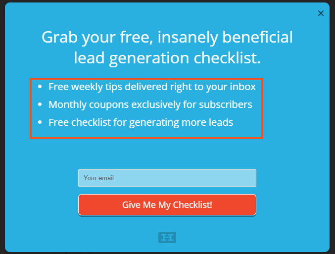
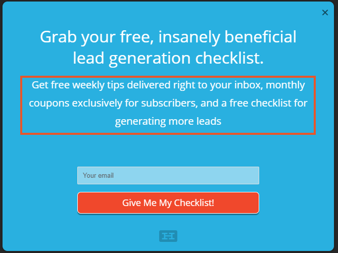
They both say the same thing, but the one with bullet points stands out because it’s easier to read and more visually organized.
10. Use Powerful Images or a Video on Your Lead Capture Page
Visual imagery can prove more persuasive than text. They’re both more immersive forms of media, and they’re more likely to grab your visitors’ attention.
Embedding a video or image near or in your lead capture form might help you get more signups. Perhaps you could create a brief video in which you announce your email list and the benefits it provides.
Sometimes, though, a picture is all you need. In this example, I’ve used a photo of Neil. He’s speaking at an event, which lends him instant credibility if he’s asking you to sign up for his email list.

You could also use a product photo, an image of a customer next to his or her testimonial, or any other image that you think works well with your brand.
11. Use a Great Call-to-Action Button
The CTA closes the deal. If it’s not appealing, your prospects will click away without bothering to sign up.
A great CTA is impactful and value-driven. Many marketers have found success in using positive statements, such as the one above: “Give Me My Checklist!” It’s written in the prospect’s voice, almost as though you’re putting words into his or her mouth.
A/B test several different CTAs to figure out what works best with your audience. Every business is unique, so you have to cater to your target customers specifically.
12. Do Not Use the Word “Submit” in Your Call to Action
We hate the word “submit.”
For one thing, it has negative connotations. You submit to a drug test at work. You submit to getting a vaccine at your doctor’s office. You submit to your great aunt’s overbearing presence at the Thanksgiving dinner table.
Plus, it conveys work. It tells your visitor that he or she must do something to get your lead magnet and emails. If there’s one thing most of us want to avoid, it’s more mind-numbing work.
Lastly, it’s boring. Enough said.
There are thousands of words you can use in place of “submit,” so give those a try instead.
13. Apply the Principles of Conversion-Centered Design (CCD) to Your Forms
CCD refers to the process of designing a user experience that ushers the user toward a desired action — conversion. Luckily, Hello Bar is already set up for CCD, so you don’t have to put much work into it.
Start with a strong shape. A square or rounded rectangle can work extremely well because it focuses your visitors’ eyes on the content within it. Make sure you use plenty of contrast, especially in the CTA button and text, and that you use a unique color for your CTA.
Arrows and leading lines can also help with CCD. You want to tell your visitors where to look. Finally, include attractive images. If they include people — or cute baby animals — you’ll be set.
14. Create Urgency
Urgency is one of the most important principles of conversion. You want your audience to feel compelled to fill in your lead capture form right away rather than putting it off.
You can do this by including a deadline for signing up. You’ve created a special lead magnet, for instance, but it won’t be available forever. We adjusted the Neil lead capture form below a bit to add some urgency.

I adjusted the Neil lead capture form a bit to add some urgency.
15. Continuously A/B Test Your Lead Capture Forms
I’ve mentioned A/B testing a couple of times in this article, but it deserves its own section because you need it to maximize your conversion rate.
During an A/B test, you present two variations of the same lead capture form to half your audience each. By changing just one variable between the two, you’ll know exactly which CTA, headline, image, or body copy performed best.
After you do one A/B test, run another. Hello Bar allows you to easily set up an A/B test between two variations, and you’ll be notified of the “winner” as soon as the test reaches statistical significance. It couldn’t be easier.
16. Make Sure Your Privacy Policy Link Is Visible When People Are Filling Out Your Lead Capture Form
People really care about their privacy. Data breaches and unauthorized emails have driven consumers into a frenzy — and for good reason.
Include a link to your privacy policy on or near your lead capture page. Make it visible, such as by changing the font color to something that isn’t found elsewhere on the page. Visitors will appreciate your transparency.
Better yet, ask them to confirm that they’ve read your privacy policy before they subscribe.
17. Think Critically About Form Length
Deciding on the ideal form length requires you to walk a bit of a tightrope.
A short form will result in more email signups. That’s obviously a good thing. However, you’ll get a lot of leads who will never turn into customers.
When you ask for more information from website visitors, you’ll get fewer signups. But don’t despair because your leads will be far more qualified.
Only high-quality leads and people who are seriously interested in your product or service will fill out 10 form fields. They won’t become customers right away, but they’re more likely to convert on subsequent offers.
18. Portray Yourself as an Authority
If you want more leads, you need prospects to view you as credible. There are lots of ways to position yourself as an authority in your industry.
For instance, you could list any degrees or certifications you have or how many clients you’ve worked with. Mention any major brands that have hired you for your services, or mention that you’ve written for major publications.
19. Optimize Lead Capture Forms for Mobile Users
With a significant portion of website traffic coming from smartphones, it’s crucial to optimize your lead capture forms for smartphone and tablet users.
Many website visitors access content on the go, so your forms must be responsive and easy to fill out on smaller screens.
Use larger touch-friendly buttons, minimize the number of fields, and implement auto-fill where possible. Consider using mobile-specific features like click-to-call buttons or social media sign-ins to streamline the process.
By making your forms mobile-friendly, you’ll capture leads more effectively from the growing segment of mobile users. This can significantly increase form conversion rates and expand your potential customer base.
Ultimate Lead Capture Form Checklist
We’ve covered a lot of ground here, so we want to provide you with a handy checklist you can follow when designing your own lead capture forms.
- Strong Headline
- Bullet Points Focusing on the Benefits of Your Offer
- Great Picture, Video, or Other Appropriate Media Choice
- Conversion-Centered Form Design
- Urgency and Trust Factor
- Excellent Copywriting
- Ideal Form Length
- Awesome Lead Magnet
- Social proof
- Testimonials
- Authority Status
- Visible Privacy Policy
Feel free to bookmark this page or print out the checklist so you can refer to it often.
Awesome Lead Capture Form Examples
Let’s look at a couple lead capture form examples that work. we want to show you how two forms with completely different styles can still generate tons of leads.
First, take a look at Hubspot’s popup.

It looks pretty simple, right? That’s because it can be. The headline invites the reader to join 215,000 fellow subscribers. That’s an insane number. The copy below describes exactly how the user will benefit from a subscription.
For an example that’s the exact opposite, check out SalesForce’s landing page and lead capture form:
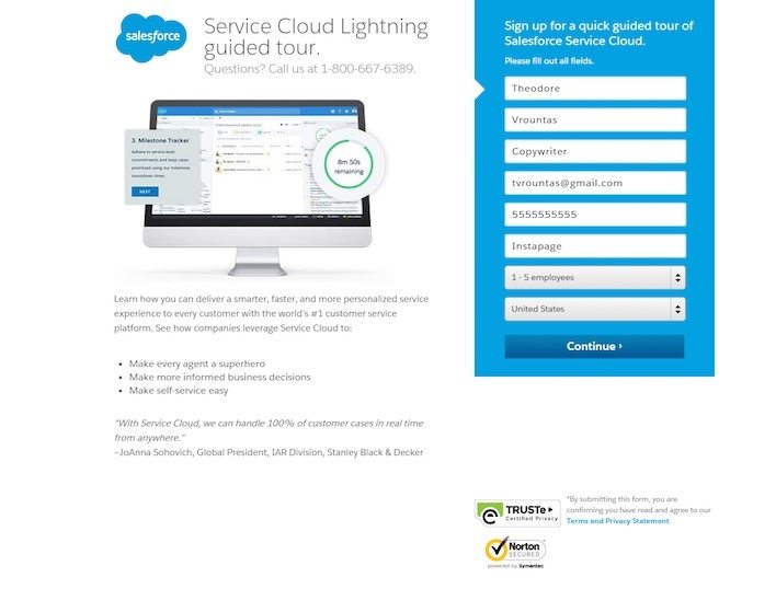
You can see the trust badges, the engaging image, the bullet points, and the intriguing headline. Additionally, there are a lot more form fields. SalesForce wants to qualify its leads from the very beginning.
FAQs
Q1. What are multi-step lead capture forms?
Rather than presenting display input fields on one single page, multi-step lead capture forms break them down into multiple sections. They make it easier for potential customers to fill in the fields without getting overwhelmed.
A multi-step lead capture form usually shows a progress bar at the top of the form that indicates how many more sections the user has to complete.
Q2. How can I reduce form abandonment on my lead capture pages?
Here are expert ways to reduce form abandonment on your lead capture pages.
- Avoid using cluttered lead capture forms with too many fields. Keep it as simple and short as possible.
- Optimize your lead capture forms for mobile, tablets, and other devices.
- Provide clear incentives and strategically placed CTAs in your lead generation form.
- Improve the page load speed of your lead generation forms.
- Use multi-step or multi-page forms to break down lengthy lead capture forms into smaller sections.
Q3. How can I use A/B testing to improve my lead capture form conversions?
You can improve your lead capture conversions with A/B testing by creating variations of the lead generation forms you intend to use. After that, experiment by splitting your audience randomly and evenly into two groups and showing them the different variations of your lead capture form.
With a tool like Hello Bar, you can easily analyze the results of the test to find the better-performing lead capture form. Going forward, use the lead capture form with the higher conversions as a guide for creating future forms.
Q4. What role does form placement play in increasing conversions?
Lack of proper form placement can lead to form abandonment, low conversions, or can result in low quality leads. As such, it is important to place the lead capture forms where site visitors are most likely to interact with them. It is also crucial to place it above the fold where it is more visible.
Q5. How can I optimize my lead capture form for mobile users?
Here are a few tips to make your forms mobile-friendly.
- When creating lead capture forms for mobile, use the single-column format rather than multi-column.
- Use multi-step lead capture forms instead of long single-page forms.
- Use mobile-responsive form builders to create lead-capture forms that easily adapt to mobile screens.
- Use larger fonts.
Conclusion
Your lead capture form can mean the difference between a thriving and sinking business. Many marketers, including myself, take email lists very seriously.
It’s a privilege to have a way to communicate directly with your audience. If you abuse it, you can ruin your company’s reputation. However, if you’re smart, you’ll convert more leads into customers.
It all starts with lead generation, though. Use Hello Bar to craft attractive, highly effective lead capture forms, then test them with your audience.
What’s your best lead generation tip?